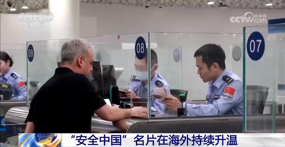
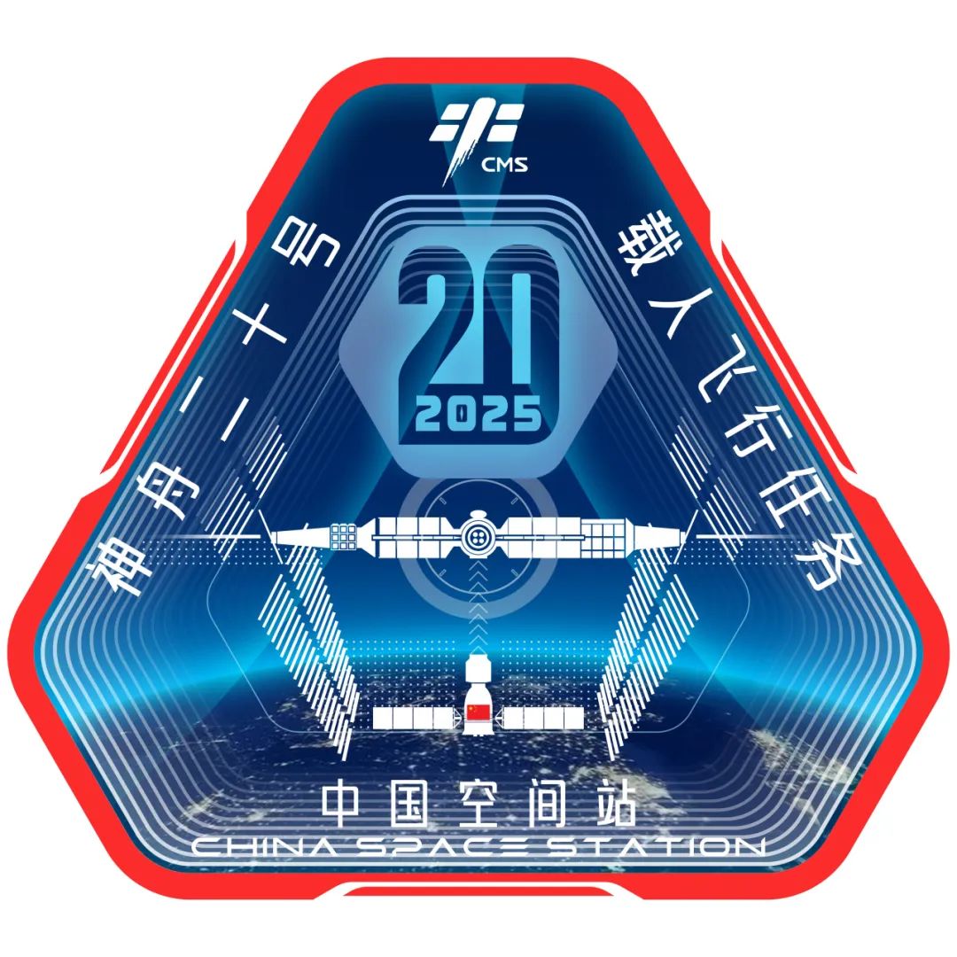
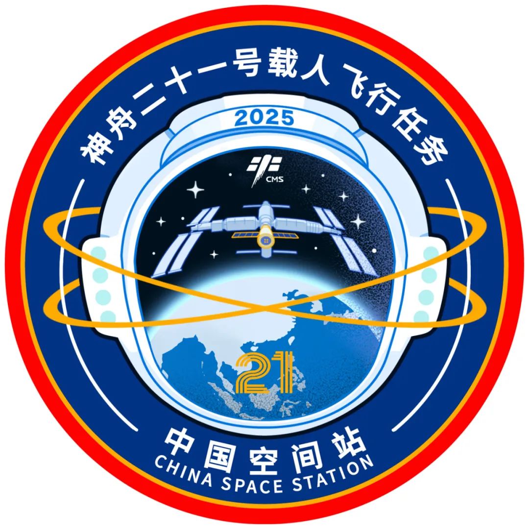
CCTV news: According to the China Manned Spaceflight WeChat official account, the 2025 manned spaceflight mission logo collection activity has been successfully concluded. The China Manned Space Engineering Office has now released the three mission logos for the 2025 Shenzhou 20 manned mission, the Shenzhou 21 manned mission, and the Tianzhou 9 mission.
 < /p>
< /p>
Author: Ma Siran
Author’s design concept
The logo of the Shenzhou 20 manned mission combines tradition and innovation, and is based on a stable triangle, symbolizing the astronauts’ climb based on experience. New peak. The red outer frame conveys the manned flight mission, and the dark blue interior symbolizes the vastness of space. The main body of the Shenzhou spacecraft is radially docked with the space station, and the solar wings cleverly form the Chinese character "十" (ie "twenty"). The bright light of the space station cuts through the sky, demonstrating the astronauts' spirit of moving forward toward the light and moving forward bravely. The logo simulates the perspective of a porthole, with clear layers and full visual depth. Simple plane patterns are intertwined with functional dot patterns and lines, adding a modern touch. This logo not only demonstrates the driving force of China's aerospace science and technology, but also expresses its infinite vision and determination for future exploration.
 < /p>
< /p>
Author: Dong Tian Gu Xin
Author's design concept
The logo of the Shenzhou 21 manned mission is ingeniously designed, using the astronaut's helmet as the perspective, highlighting "people" as the main body of space exploration. The image of astronauts represents the struggle and dedication of Chinese astronauts and is closely connected with manned space missions. The helmet has a spherical design and "2025" is engraved on the top to highlight the year of the mission. Above the window, Shenzhou 21 and the space station successfully docked in the starlight. The lower part of the assembly reflects the motherland, symbolizing the feelings of family and country. The two rings surrounding the helmet not only resemble ancient celestial instruments, but also symbolize the stars in the universe, conveying the Chinese people's eternal pursuit of exploring the universe. The logo is simple but profound, integrating modern technology and traditional culture, showing the courage and determination of Chinese astronauts, as well as the eternal spirit of exploration of the infinite mysteries of the universe.
 < /p>
< /p>
Author: Yao Jia Sun Jiandong
Author's design concept
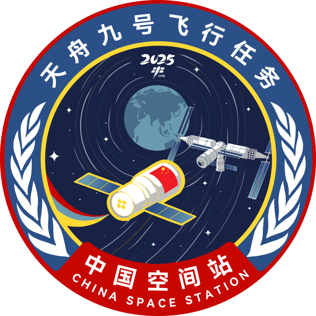
The Tianzhou-9 mission logo uses the earth as the background, and the rendezvous and docking of the spacecraft and the space station as the visual center, showing the magnificent posture of the two flying around. The dynamic arc of the spacecraft represents the flight trajectory, conveying the beauty of precision and power. The number "9" is cleverly painted on the star track, and nine stars surround it, implying that Tianzhou-9 is moving towards the future, carrying the lofty ideals of space exploration and the spirit of teamwork. The outer circle of the logo is red, symbolizing the country's honor and mission; the gold is embellished in it, reflecting brilliant achievements. The inner circle is as dark blue as the vastness of the universe, setting off the white space station and spaceship. The sense of modern science and technology is vividly visible, highlighting the ambition and unremitting pursuit of exploring the universe.